prev >
Analyzing audience sentiment and event success of enterprise webcasts.
Lead UX & Visual Design
Basis
Enterprise Webcasting
2018
Event360 is a new product offering from MediaPlatform (MP), a leading end-to-end enterprise broadcasting platform, that allows non-technical MARCOM and CORCOM stakeholders to check the pulse of their webcasts.
As the lead UX and visual designer on the project, I developed a scalable dashboard that enables non-technical stakeholders to spot new, unexpected patterns between video content, streaming quality, and audience sentiment.

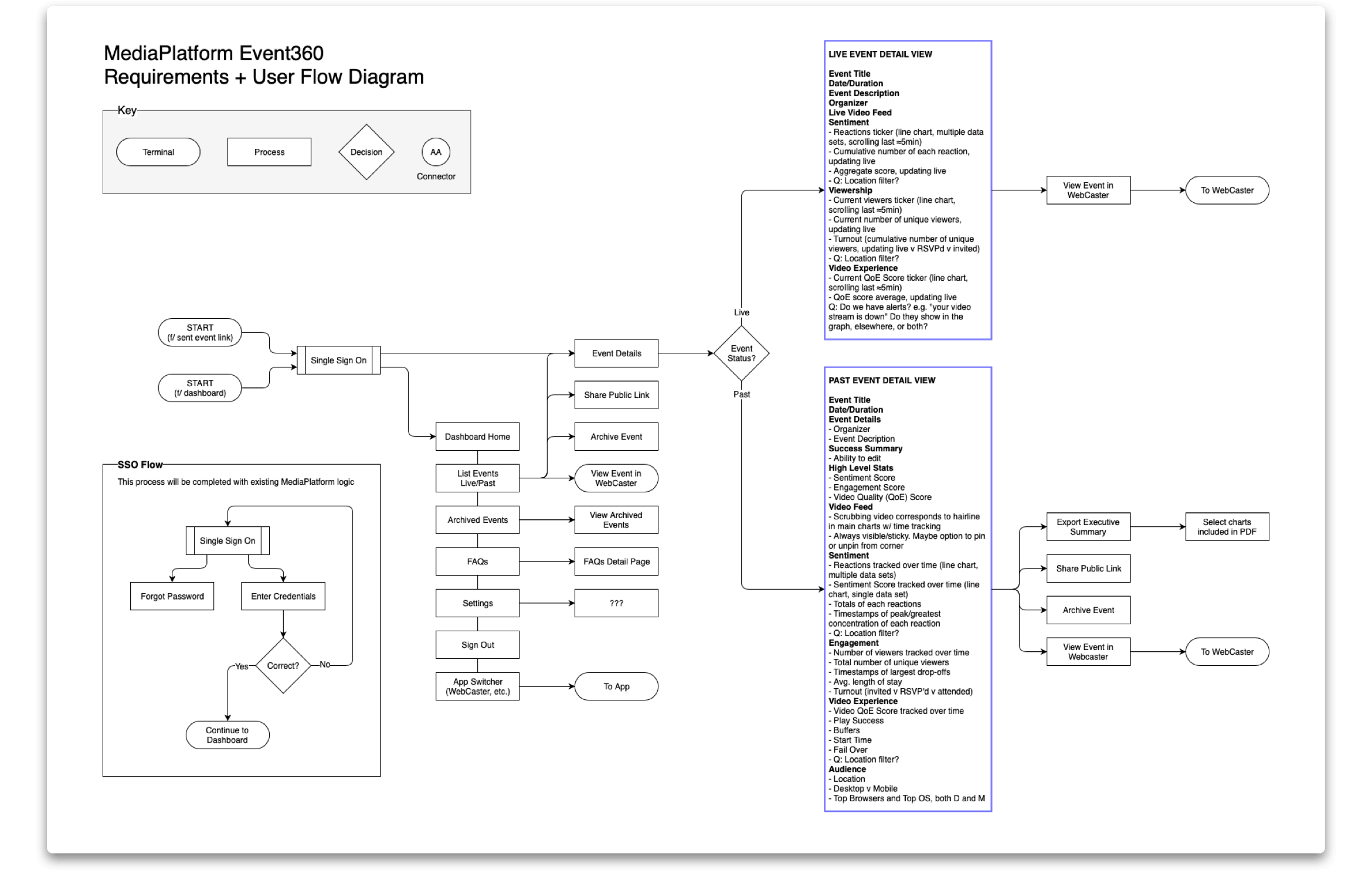
After defining a simple user flow for the dashboard, I focused my efforts on requirement gathering — leading whiteboard sessions and brainstorming — to understand which metrics were most helpful to MP’s customers and discover exciting ways to link existing data to new sentiment data we were introducing with this product.
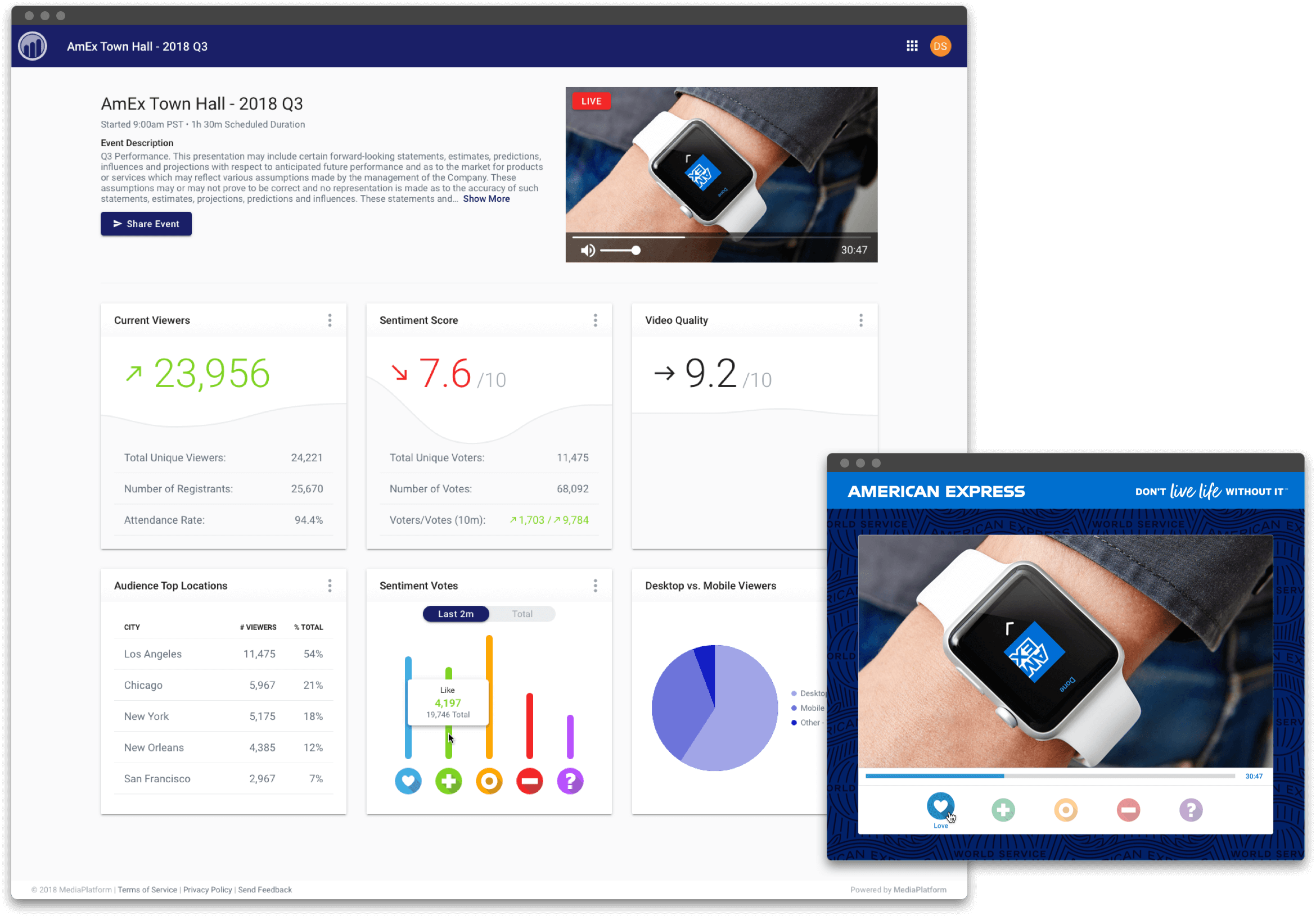
When viewing live events, marketing and event producers need to quickly and easily see the overall status of their webcast. I designed the Live Event dashboard to feature the large key stats the clients are looking for (current viewership, sentiment, and video quality) while adding trend arrows like a stock ticker to show which way the numbers are moving. I found that sometimes the single data point of a live stat may misrepresent the spread, so I added subtle graphs to the background of the cards that scroll by revealing movement over the last 2 minutes.

Large stats and trend arrows allow stakeholders to quickly check the pulse of their webcast in real time while subtle graphs correct for outliers by showing movement over the last 2 minutes. Sentiment data, gathered via a widget on the video player, provides a new layer of emotional data from the audience.
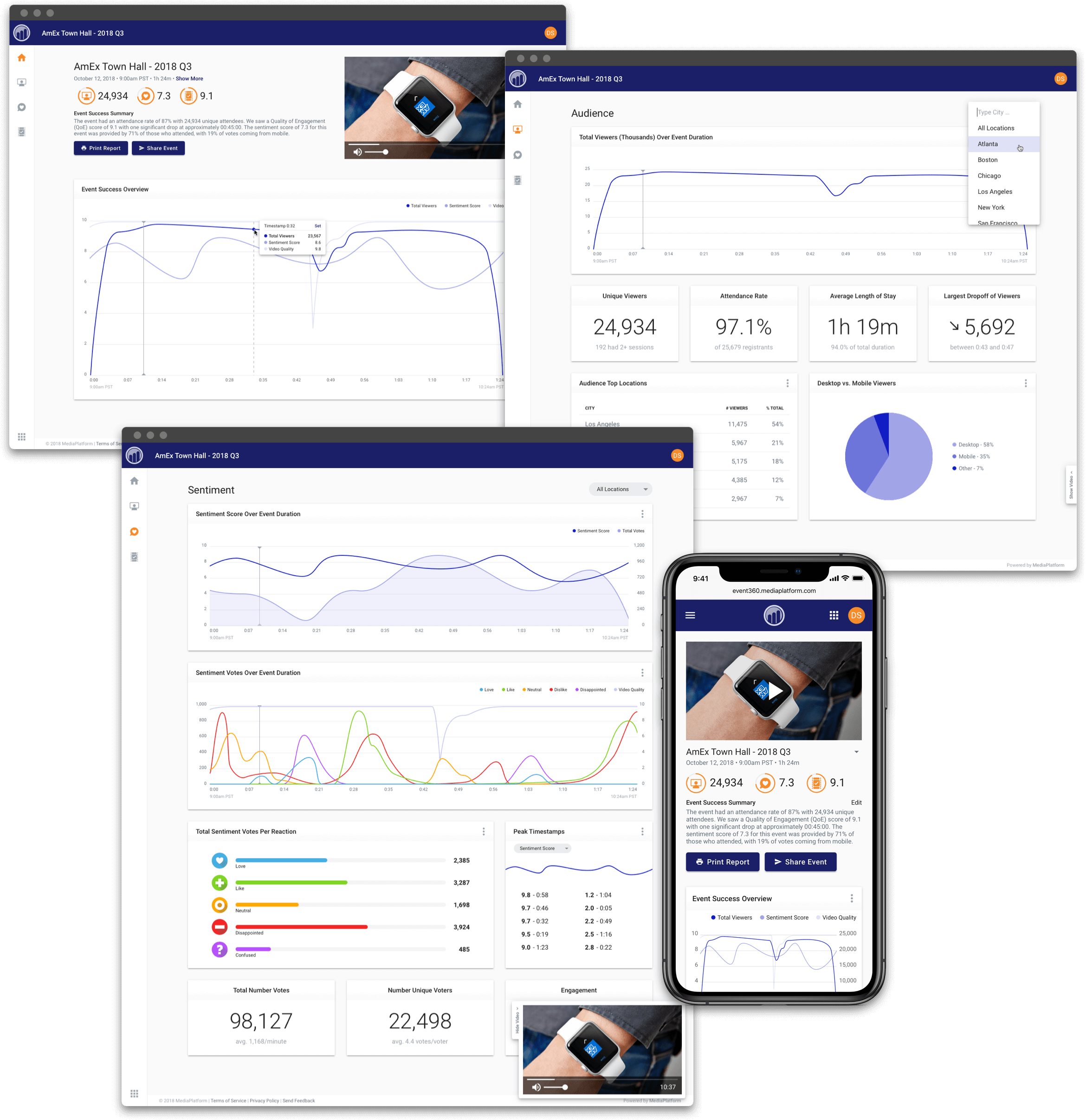
In post-live events and on-demand videos, we are able to present most of the data over the duration of the video. To help spot trends, I added a global marker on the timeline of all graphs that syncs with the playhead on the ever-present video, allowing for easy comparison of data and content across all dashboard screens.

Consistent use of color, overlaid graphs, and a globally-synced timeline marker and video playhead help users recognize correlations between video content, streaming quality, and audience sentiment on post-live events and on-demand videos.